
Pick a project.
I have undertaken quite a few product design projects in my professional career. Below are a selection of these projects. Don’t be shy, pick one and have a look!

Jo Loves Christmas Candles

Space NK Shimmering Spice Candle

Deco & Ware Lava Rock Diffusers

Jo Loves Christmas Candle
This project was a collaboration Jo Loves did with a talented artist that produces expressive eye-catching patterns. The patterns were provided by the brand and we had to visualize and effectively produce the patterns on to the glass tumbler, as well as guide the client with other aspects of the candle and packaging.
Packaging
Visual Mock-ups
Pattern Development

Pattern 1

Pattern 2
The client supplied two patterns for us to evaluate and visualize. It was immediately evident that due to the complexity of the design, a decal would be the best option of decorating the candle glass. Hydro-dipping was considered, however it was established the ‘ice-weight’ (the solid base of glass) had to be visible at the request of Jo Loves. Mock-ups were then created to evaluate which pattern would look best as decal on the glass.

Pattern 1
Mock-up

Pattern 2
Mock-up
Visuals were sent to the client and they opted to go for pattern 1 (red and gold pattern). To get the pattern ready for the decal manufacturer, it was decided the pattern should be vectorised and split into 4 main colour categories to achieve the pattern. It was also confirmed that the client wanted the gold areas to be an organic gold ink which would create a semi-metallic effect.

The decal itself was split into 3 main colours, of which all had a pantone assigned to them apart from the organic gold colour. The organic gold colour was matched by the decal manufacturer from some physical samples the client sent through that they wanted the colour to match to. There was a 4th colour on the pattern, and to create a cohesive aesthetic to the candle glass it was decided this would be the colour the glass was decorated in. To keep the ‘ice-weight’ visible we would use an internal spray decoration method.
The colours chosen are shown in the image below. You will also notice in the image that the decal has a slight curvature. This is to allow the decal to fit correctly and allow for the taper in the glass.


The internal spray decoration is visible through the decal, giving it the desired cohesive aesthetic the client wanted to achieve.
The Finished Product

The project also included a larger 4-wick size candle that retailed for around £350. We used the same methodology but scaled it up to fit the larger glass. The 4 -wick candles sold out much faster than anticipated, so we had to turn-around another production run within a month.
Below is also an image showing the single wick candle in all of its glory.


Space NK Shimmering Spice Candle
This project was for the renowned Space NK brand. They wanted a candle produced for their Christmas range using a ‘bauble’ pattern, of which was repeated throughout the range that year. The starting point of the project was providing us with an image of the baubles that wanted to use on the pattern. A special request from the client was that the light of the candle flame would gently shine through the baubles on the candle glass.
Packaging & Labels
Visual Mock-ups
Pattern Development

The baubles they provided us with were 4 metallic colours. A red, purple, green and blue colour. They wanted these baubles patterned around the packaging and the candle maintaining the metallic finish.
We started by evaluating the best approach to achieve the metallic finish on both the carton and candle glass, as well as establishing a pattern layout the client wanted achieve.
The Carton
The pattern on the carton needed to highlight the metallic baubles however the rest of the carton was to be an opaque matt finish. The metallic baubles were achieved by the carton material being a metallic card. This allowed colours printed directly onto the mirror side of the board to shine through. The areas without metallic are printed in black which blocks out the mirror shine on the board. A matte varnish was then applied to the non-metallic areas.
Glass Decoration Label
It was decided a label was the best option in terms of practicality and cost for the client to decorate the glass.
It was difficult because we initially wanted to use 4 different coloured foils to match the colour of the baubles. This however was impractical as the registration of the 4 different foils would be extremely difficult for the printers. We therefore decided to foil onto the label using a single silver foil, and then print on top of that using 4 colour process and white. This achieved a really nice finish, and when the candle burnt the flame lit up the baubles.


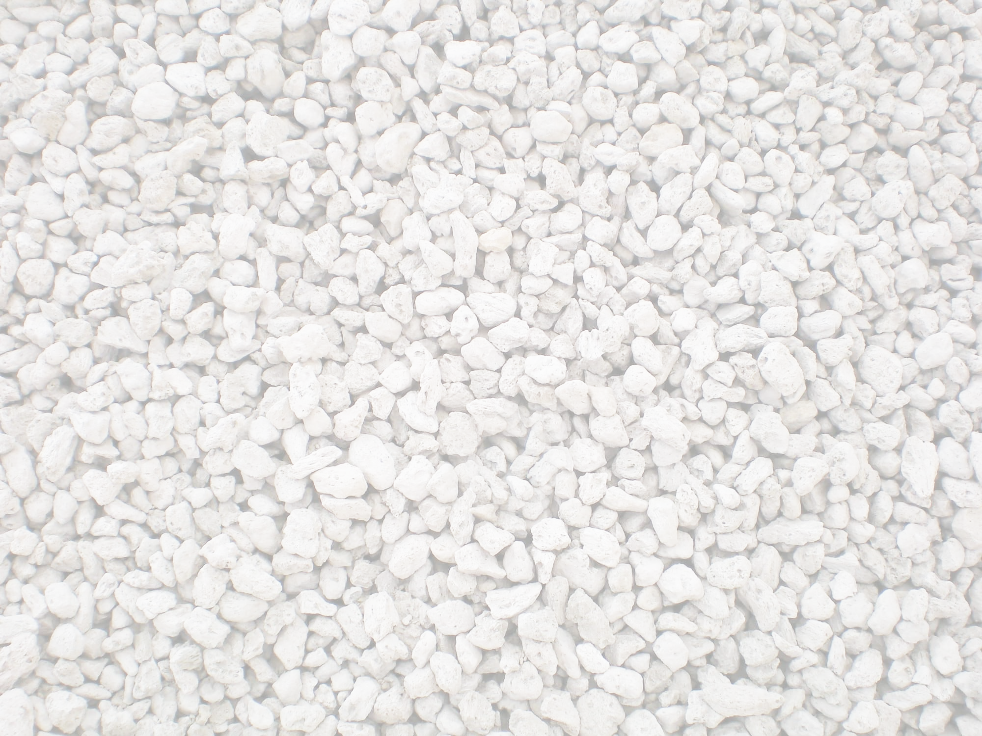
Lava Rock Diffuser Deco & Ware
One of the more unique products I created for Deco & Ware was the lava rock diffusers. Utilising the porosity of pumice (a type of lava rock), this concept uses a unique essential oil blend which is dropped onto the lava rocks. The rocks then absorb the essential oil blend and diffuse slowly and gently into the air. The customer simply needs to add more drops for when the fragrance fades.
Conception
Packaging and Product Design
Component Sourcing
CLP and British Standard Compliance


The three lava rock diffuser fragrances have an icon associated with them which is representative of the desired effect it has on the customer. The 3 fragrances are; mood boosting, energising and relaxing.

The diffusers were designed to use off-the-shelf components as they could be easily supplied and it saved having get custom tooling made which would have been a big upfront cost.


